Gameplay Panel
Town controls, banners, Bazaar containers, standings, settings groups, and tactical windows.

Visual Component Library · Phase 3 Review
A proposed shared visual language for every interface in the game. This review page does not alter gameplay; it establishes the families that will replace inconsistent one-off styling.
Review specimen — not yet migrated globallyCinzel supplies medieval character and authority. Lora carries descriptions, instructions, settings, and other reading-heavy content.
Recruit Paladin
Paladins are elite heavy fighters trained to hold the line. Their clear role and readable statistics should remain understandable even over detailed town artwork.
Supporting text remains at 13px or larger. Important instructions use 15–16px.
Rule: Cinzel is never used for long paragraphs or brittle 9–10px interface copy.
Dark stone and indigo handle active play. Parchment is reserved for comfortable reading. Void is the quietest, deepest layer.
Town controls, banners, Bazaar containers, standings, settings groups, and tactical windows.
How to Play, lore, patch notes, longer explanations, and reference material. Dark ink is always paired with parchment.
Tooltips, card footers, deep wells, and restrained negative space behind high-priority content.
Gold progresses, stone supports, violet selects or invokes magic, red destroys, and quiet controls step aside. These roles should not be mixed.
The violet crystal construction is isolated as the magic/selection family. It can later accept authored Photoshop textures without changing spacing, text, or behavior.
These measurements are the working baseline for desktop QA, not loose examples.
| Property | Standard action | Icon action | Rule |
|---|---|---|---|
| Height | 44px | 44 × 44px | Geometry never changes between states. |
| Minimum width | 132px | 44px | Wide progression actions may use 190px. |
| Horizontal padding | 20px | 0 | 9px gap when an icon and label appear together. |
| Command type | Cinzel 700 · 14px | 17px symbol | Uppercase, 0.08em tracking, one line. |
| Structure | 1px border · 4px corner | Same | Material changes; the underlying frame does not. |
| Motion | 140ms standard | 140ms standard | Hover lifts 1px; pressed moves down 1px. |
| Focus | 2px violet external ring | Same | Always visible for keyboard input. |
| Disabled | 42% opacity | Same | No hover lift; cursor communicates unavailable. |
Loading preserves width so surrounding controls never jump.
| Family | Default | Hover | Pressed | Keyboard focus | Disabled | Loading |
|---|---|---|---|---|---|---|
| Primary | ||||||
| Secondary | ||||||
| Magic / recruit | ||||||
| Danger | ||||||
| Quiet | ||||||
| Icon |
Each specimen uses the same controls without one-off contrast fixes.
Labels remain above fields, help text remains separate from values, and interactive targets stay at least 42px tall.
All tags use one base geometry. Color indicates category or rarity. Only the four key combat statistics require symbols.
This replaces the visually overlapping tag, pill, metadata-pill, trait, and sort-chip styling.
The speed symbol remains a placeholder until the raised running-boot icon is authored.
Bazaar units need strong art, large names, key statistics, traits, price, and one obvious action. Buildings and banners remain compact rows.
The Bazaar remains compact enough for five offers; the dossier carries the complete explanation.

Contains comparison essentials: identity, race, combat traits, four stats, price, and action.
Tier IV · Legendary
Elite human warriors trained to hold the line through punishment and protect nearby allies.
Full description, traits, ability, role, synergies, availability, and expanded art live here.
Elite human warriors trained to hold the line through punishment and protect nearby allies.
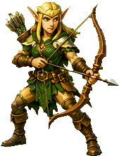
Precise ranged troops that punish lightly armoured targets from behind a protected line.
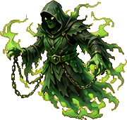
Spectral attackers that drift through the melee and bring fissure magic into close combat.

A consistent header, close control, body measure, action footer, backdrop, and stacking model replaces individually constructed windows.
Gameplay, parchment, and confirmation windows change material—not construction.
Body copy and controls use the same inset. Longer reading never stretches across the entire screen.
The 680px reading measure applies to prose. Tactical grids may use wider bodies while retaining the same header and footer.
Dark indigo for active play and tactical controls.
Parchment for sustained reading, lore, and reference material.
Focused language and no unrelated controls.
These findings are based on the current source, the Phase 1 inventories, and the latest playable Phase 3 baseline.
The current utility class represents purchases, navigation, tabs, warnings, closing, market increments, and ordinary secondary actions.
168 static elements carry inline styles. Several require later overrides or !important, making visual changes fragile.
Important labels and metadata reach 8.5–10px with wide letter spacing. Cinzel becomes especially brittle at these sizes.
Tags, metadata pills, detail tags, and sort chips communicate similar information with unrelated sizes, corners, and interaction cues.
At least 17 radius forms are present. Ornamental frames should create character while four structural corner values provide consistency.
Settings, tutorials, confirmations, recap, Compendium, and end-state windows use different header spacing, close controls, body measures, and action placement.
Dark cards, parchment reading surfaces, restrained gold, and violet magic produce a distinct identity when their roles remain disciplined.
IDs and event handlers do not need to be renamed. Canonical classes can wrap the current behavior while presentation is migrated family by family.
Each pass should preserve every existing action, then receive a focused visual and interaction check before the next family is migrated.
| Pass | Current concepts | Canonical family | Reason |
|---|---|---|---|
| 1 · Actions | .big, .ubtn, buy, close, reroll, mode and difficulty controls | Primary, secondary, magic, quiet, danger, icon | Highest repetition and the most visible inconsistency. |
| 2 · Navigation | Chat tabs, Settings tabs, leaderboard tabs, sort chips, view toggles | Tab rail, segmented selector, noninteractive badge | Separates navigation from commands and labels. |
| 3 · Windows | Overlay cards, Settings, tutorial, Compendium, recap, confirmation gates | Gameplay window, parchment reading window, modal, tooltip, toast | Creates reliable spacing, close placement, and text measure. |
| 4 · Cards | Bazaar card, building row, banner row, Compendium item | Unit offer card, compact information row, selected list item | Improves the game’s most decision-heavy content. |
| 5 · Controls | Text fields, selects, sliders, toggles and developer inputs | Field, help text, switch, range control | Finishes consistency and keyboard accessibility. |
| 6 · Cleanup | Inline declarations, duplicate selectors, literal values | Shared classes and approved tokens | Prevents the inconsistencies from returning. |
First integration: Actions on the Bazaar—Recruit, reroll, lock, upgrades, To Battle, close, and destructive controls.